renv::install("RColorBrewer")
renv::install("viridis")
renv::install("dplyr")
renv::install("plotly")Exercise - Block 3
Introduction to ggplot2 advanced topics
In the last block, we learned the basics of ggplot2. In this block, we will explore more advanced topics to make our plots publication-ready. We will cover:
- Faceting: Creating subplots to compare different subsets of your data.
- Themes: Customizing the appearance of your plots.
- Colors: Using colors effectively and exploring different color palettes.
- Interactivity: Making your plots interactive with
ggplotly.
Installing packages
Packages
library(ggplot2)
library(patchwork)
library(RColorBrewer)
library(viridis)
library(dplyr)
library(plotly)
Exploratory data analysis
data <- readRDS(gzcon(url(
  "https://raw.githubusercontent.com/urppeia/publication_figs/main/data.rds"
)))
Faceting
In Block 2, we created two separate volcano plots for the 3h and 24h timepoints. We can use faceting to create a single plot with two panels.
Exercise 1
Create a single volcano plot faceted by timepoint. Store the plot as an object named p1.
Tip
# Create a single data frame for both timepoints
diff_df <- data.frame(
  lfc = c(data$diff$sucrose_3h_lfc, data$diff$sucrose_24h_lfc),
  pval = c(data$diff$sucrose_3h_pval, data$diff$sucrose_24h_pval),
  timepoint = rep(c("3h", "24h"), each = nrow(data$diff))
)
diff_df$significant <- diff_df$pval < 0.05 & abs(diff_df$lfc) > 1

p1 <- ggplot(diff_df, aes(x = lfc, y = -log10(pval), color = significant)) +
  geom_point(size = 2, alpha = 0.7) +
  scale_color_manual(values = c("gray70", "tomato")) +
  geom_vline(xintercept = c(-1, 1), linetype = "dashed", color = "red") +
  geom_hline(yintercept = -log10(0.05), linetype = "dashed", color = "blue") +
  labs(
    title = "Volcano Plot — Sucrose Treatment",
    x = "log2 Fold Change",
    y = "-log10(p-value)"
  ) +
  facet_wrap(~timepoint)

p1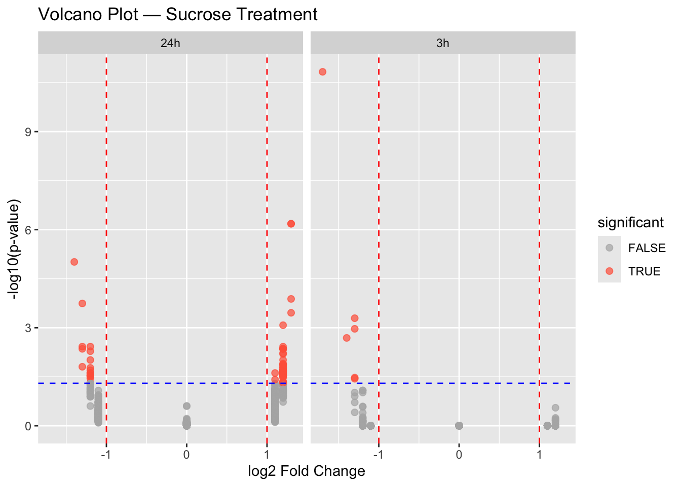
Themes
ggplot2 comes with several built-in themes. You can also create your own themes to have full control over the appearance of your plots.
Exercise 2
A. Apply the theme_minimal() to the faceted volcano plot. Store the plot as p2a.
Tip
p2a <- p1 + theme_minimal()
p2a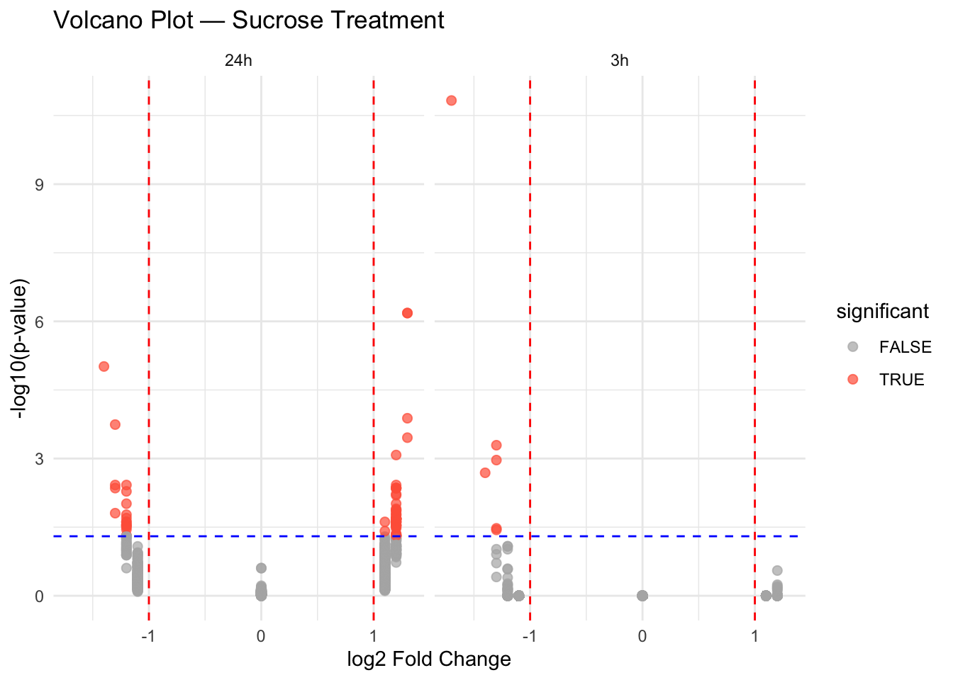
B. Customize the theme. Make the following changes: * Increase the title font size to 16. * Remove the panel grid lines. * Change the panel background to light gray. Store the plot as p2b.
Tip
p2b <- p2a +
  theme(
    plot.title = element_text(size = 16),
    panel.grid = element_blank(),
    panel.background = element_rect(fill = "lightgray", color = NA)
  )
p2b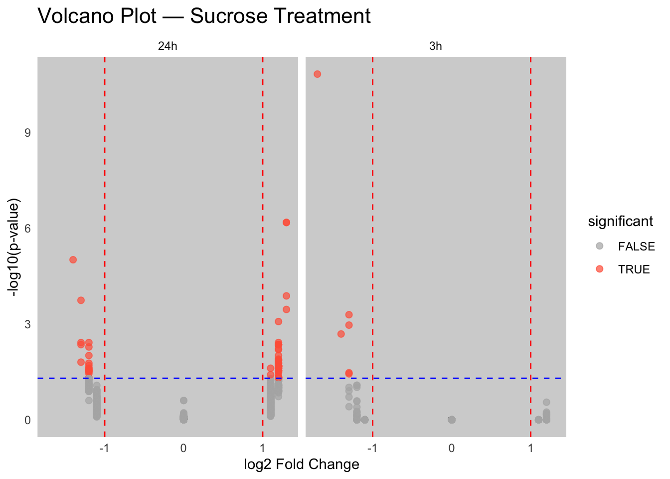
Colors
Colors are a powerful tool in data visualization. ggplot2 provides many ways to work with colors.
Exercise 3
Let’s go back to the boxplot of expression data.
data_long <- merge(data$anno, reshape2::melt(data$counts))Using Gene_ID as id variablesA. Use a color palette from RColorBrewer. Store the plot as p3a.
Tip
p3a <- ggplot(data_long, aes(x = Sample_ID, y = value, fill = compound)) +
  geom_boxplot(outlier.shape = NA) +
  theme(axis.text.x = element_text(angle = 90, hjust = 1)) +
  labs(
    title = "Normalized expression per sample",
    x = "Sample",
    y = "Expression"
  ) +
  scale_fill_brewer(palette = "Set2")
p3a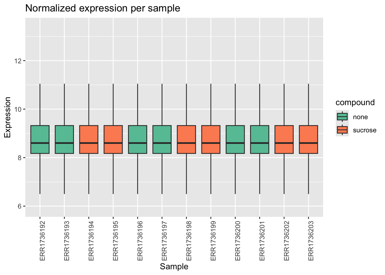
B. Use the viridis color palette. Store the plot as p3b.
Tip
p3b <- ggplot(data_long, aes(x = Sample_ID, y = value, fill = compound)) +
  geom_boxplot(outlier.shape = NA) +
  theme(axis.text.x = element_text(angle = 90, hjust = 1)) +
  labs(
    title = "Normalized expression per sample",
    x = "Sample",
    y = "Expression"
  ) +
  scale_fill_viridis_d()
p3b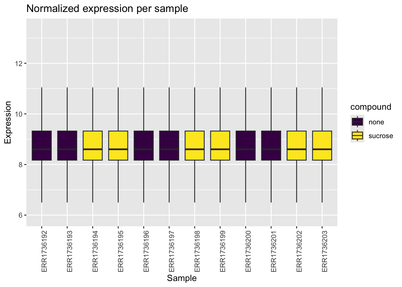
C. Specify colors manually. Store the plot as p3c.
Tip
p3c <- ggplot(data_long, aes(x = Sample_ID, y = value, fill = compound)) +
  geom_boxplot(outlier.shape = NA) +
  theme(axis.text.x = element_text(angle = 90, hjust = 1)) +
  labs(
    title = "Normalized expression per sample",
    x = "Sample",
    y = "Expression"
  ) +
  scale_fill_manual(values = c("none" = "#66c2a5", "sucrose" = "#fc8d62"))
p3c
Saving plots for publication
When preparing figures for publication, journals often have strict requirements for file format, dimensions, and resolution.
Exercise 4
Let’s save the faceted volcano plot from Exercise 2B (p2b).
A. Save the plot as a PNG file with a width of 8 inches, a height of 4 inches, and a resolution of 300 dpi.
Tip
ggsave("volcano_plot.png", plot = p2b, width = 8, height = 4, dpi = 300)B. Save the plot as a PDF file. PDF is a vector format, which is ideal for publications as it can be scaled without losing quality.
Tip
ggsave("volcano_plot.pdf", plot = p2b, width = 8, height = 4)Warning in grid.Call.graphics(C_text, as.graphicsAnnot(x$label), x$x, x$y, :
for 'Volcano Plot — Sucrose Treatment' in 'mbcsToSbcs': - substituted for —
(U+2014)C. Save the plot as a TIFF file.
Tip
ggsave("volcano_plot.tiff", plot = p2b, width = 8, height = 4, dpi = 300)Fine-tuning stylistic elements
Journals often have specific guidelines for fonts and line weights.
Exercise 5
Let’s modify the volcano plot to meet some hypothetical publication guidelines.
A. Change the font family to “Arial”. Store the plot as p5a.
Tip
p5a <- p2b +
  theme(text = element_text(family = "Arial"))
p5a
B. Adjust the line weights. Make the axis lines thicker (size = 1) and the facet borders thinner (size = 0.5). Store the plot as p5b.
Tip
p5b <- p5a +
  theme(
    axis.line = element_line(linewidth = 1),
    strip.background = element_rect(linewidth = 0.5)
  )
p5b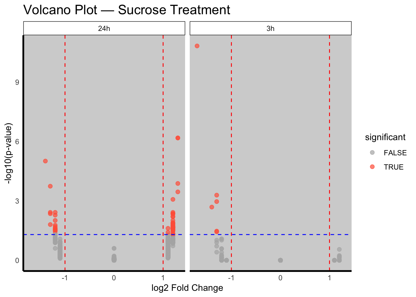
Additional Plot Types
Exercise 6: Scatter plot with regression line
Let’s explore the relationship between the expression of two samples.
A. Create a scatter plot of the expression of the first two samples in the data$counts dataframe. Store the plot as p6a.
Tip
# Create a dataframe with the first two samples
sample_df <- data.frame(
  sample1 = data$counts[, 2],
  sample2 = data$counts[, 3]
)

p6a <- ggplot(sample_df, aes(x = sample1, y = sample2)) +
  geom_point() +
  labs(
    title = "Sample Expression Correlation",
    x = "Sample 1 Expression",
    y = "Sample 2 Expression"
  )
p6a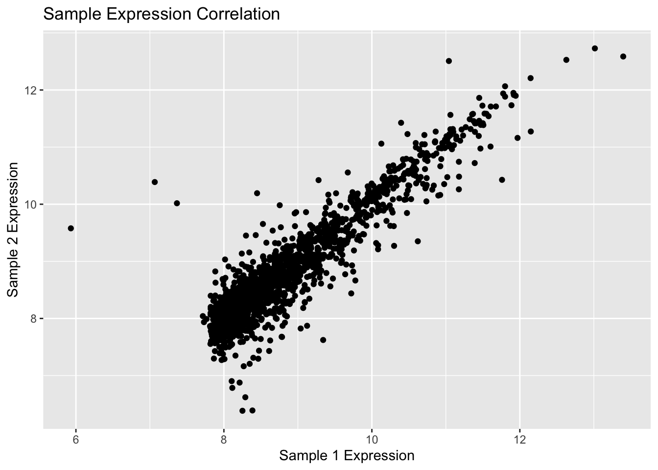
B. Add a linear regression line to the scatter plot. Store the plot as p6b.
Tip
p6b <- p6a +
  geom_smooth(method = "lm")
p6b
`geom_smooth()` using formula = 'y ~ x'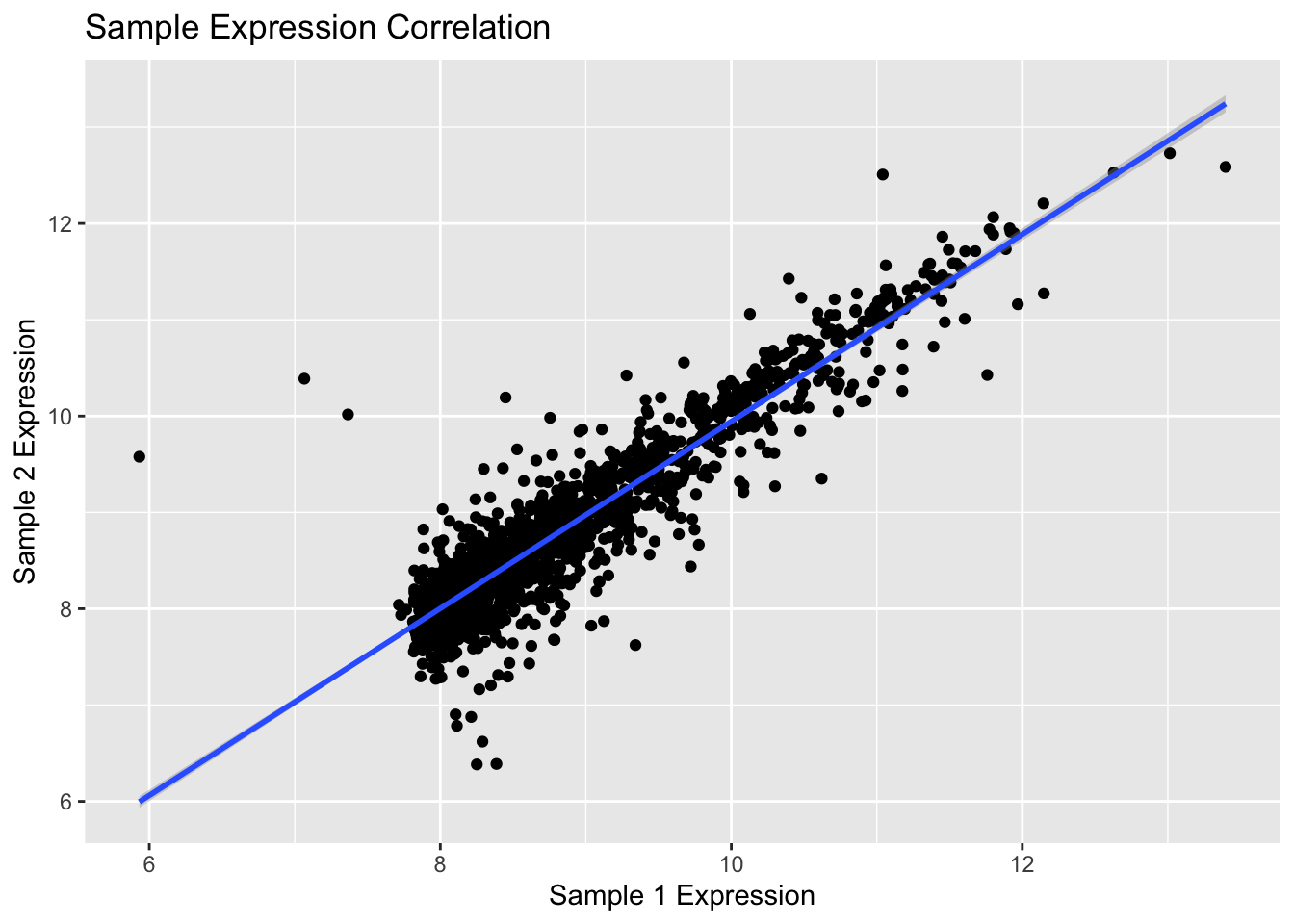
Exercise 7: Bar plot with error bars
Let’s visualize the average expression of each compound.
A. Calculate the mean and standard deviation of expression for each compound.
Tip
summary_df <- data_long %>%
  group_by(compound) %>%
  summarise(
    mean_expr = mean(value),
    sd_expr = sd(value)
  )

print(summary_df)
# A tibble: 2 × 3
compound mean_expr sd_expr
<chr> <dbl> <dbl>
1 none 8.86 0.939
2 sucrose 8.86 0.939B. Create a bar plot of the mean expression with error bars representing the standard deviation. Store the plot as p7.
Tip
p7 <- ggplot(summary_df, aes(x = compound, y = mean_expr, fill = compound)) +
  geom_bar(stat = "identity") +
  geom_errorbar(
    aes(ymin = mean_expr - sd_expr, ymax = mean_expr + sd_expr),
    width = 0.2
  ) +
  labs(
    title = "Average Gene Expression by Compound",
    x = "Compound",
    y = "Mean Expression"
  ) +
  theme_minimal()
p7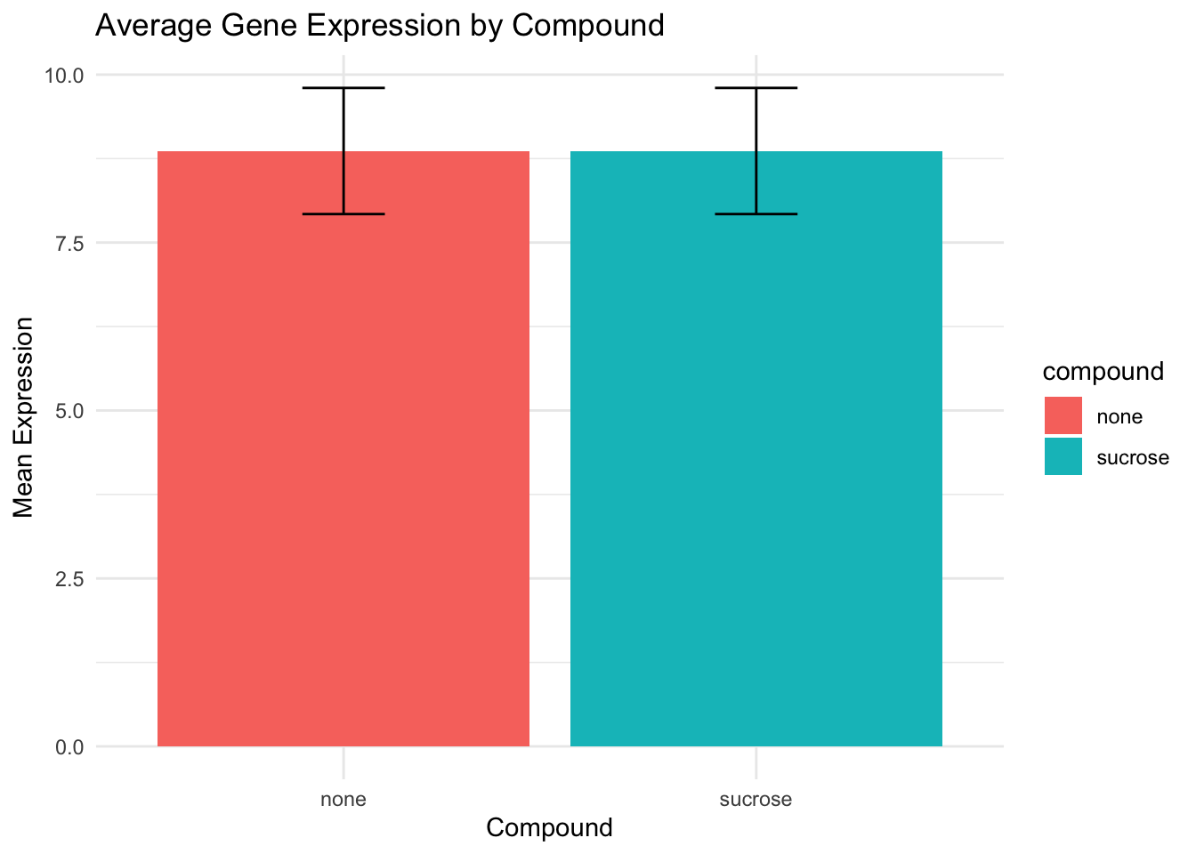
Interactive plots with ggplotly
ggplotly is a function from the plotly package that converts a ggplot object into an interactive plotly object.
Example
Let’s take the volcano plot from Exercise 1 (p1) and make it interactive.
ggplotly(p1)Now, let’s try it on the scatter plot from Exercise 6b (p6b).
ggplotly(p6b)`geom_smooth()` using formula = 'y ~ x'Exercise 8: Your turn!
A. Create a scatter plot of lfc vs -log10(pval) from the diff_df dataframe, colored by timepoint. Store it as an object called p8.
Tip
p8 <- ggplot(diff_df, aes(x = lfc, y = -log10(pval), color = timepoint)) +
  geom_point(alpha = 0.7) +
  labs(
    title = "Volcano Plot by Timepoint",
    x = "log2 Fold Change",
    y = "-log10(p-value)"
  )
p8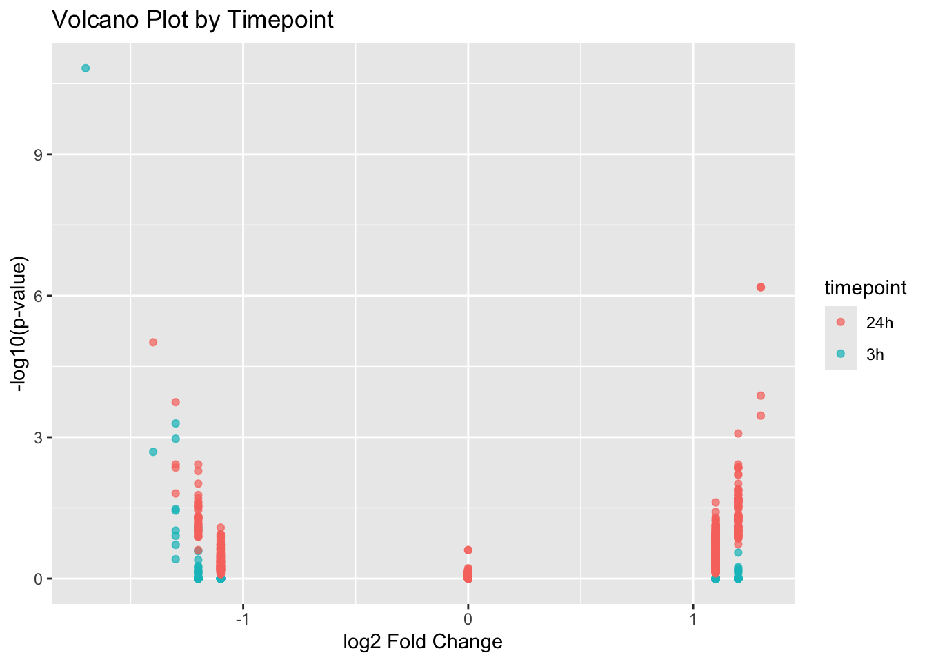
B. Now, use ggplotly to make the plot interactive.
Tip
ggplotly(p8)C. What if one just want to see 24h dots?.
Tip
One can simply click on 3h dot in the legend, and they will disappear.
Session information
Tip
sessionInfo()R version 4.5.1 (2025-06-13)
Platform: aarch64-apple-darwin20
Running under: macOS Tahoe 26.0.1
Matrix products: default
BLAS: /Library/Frameworks/R.framework/Versions/4.5-arm64/Resources/lib/libRblas.0.dylib
LAPACK: /Library/Frameworks/R.framework/Versions/4.5-arm64/Resources/lib/libRlapack.dylib; LAPACK version 3.12.1
locale:
[1] en_US.UTF-8/en_US.UTF-8/en_US.UTF-8/C/en_US.UTF-8/en_US.UTF-8
time zone: Europe/Zurich
tzcode source: internal
attached base packages:
[1] stats graphics grDevices datasets utils methods base
other attached packages:
[1] plotly_4.11.0 dplyr_1.1.4 viridis_0.6.5 viridisLite_0.4.2
[5] RColorBrewer_1.1-3 patchwork_1.3.2 ggplot2_4.0.0
loaded via a namespace (and not attached):
[1] Matrix_1.7-3 gtable_0.3.6 jsonlite_2.0.0
[4] compiler_4.5.1 BiocManager_1.30.26 renv_1.1.5
[7] Rcpp_1.1.0 tidyselect_1.2.1 stringr_1.5.2
[10] gridExtra_2.3 tidyr_1.3.1 splines_4.5.1
[13] scales_1.4.0 yaml_2.3.10 fastmap_1.2.0
[16] lattice_0.22-7 plyr_1.8.9 R6_2.6.1
[19] labeling_0.4.3 generics_0.1.4 knitr_1.50
[22] htmlwidgets_1.6.4 tibble_3.3.0 pillar_1.11.1
[25] rlang_1.1.6 utf8_1.2.6 stringi_1.8.7
[28] xfun_0.53 S7_0.2.0 lazyeval_0.2.2
[31] cli_3.6.5 mgcv_1.9-3 withr_3.0.2
[34] magrittr_2.0.4 crosstalk_1.2.2 digest_0.6.37
[37] grid_4.5.1 nlme_3.1-168 lifecycle_1.0.4
[40] vctrs_0.6.5 evaluate_1.0.5 glue_1.8.0
[43] data.table_1.17.8 farver_2.1.2 reshape2_1.4.4
[46] purrr_1.1.0 httr_1.4.7 rmarkdown_2.30
[49] tools_4.5.1 pkgconfig_2.0.3 htmltools_0.5.8.1