Recap of Block 1
- Data Types: We learned about different data types (Numeric, Categorical, Time-series, etc.).
- Chart Types: We explored various chart types and when to use them (Bar, Pie, Histogram, Boxplot, Scatter, etc.).
- Base R Plotting: We used base R functions like
plot(), hist(), and boxplot() to create basic visualizations.
- Data to Viz: We were introduced to the data-to-viz.com resource.
Key Base R Plotting Functions
We used several functions to create plots:
plot(): For scatter plots and general purpose plotting.hist(): For histograms to show data distribution.boxplot(): For boxplots to see spread and outliers.barplot(): For bar charts to compare categorical data.
While powerful, base R plotting can be complex for custom and advanced plots.
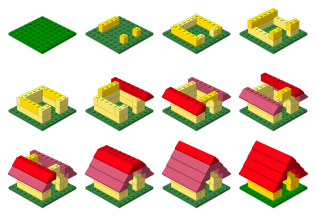
Grammar of data visualization
![]()
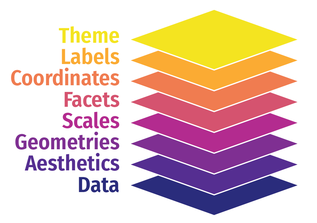
The Grammar of Graphics (gg)
data to be drawn from
aesthetic mappings from data to some visual marking
geometric objects on the plot
The Grammar of Graphics (gg)
scales define the range of values
coordinates to organize location
labels describe the scale and markings
facets group into subplots
themes style the plot elements
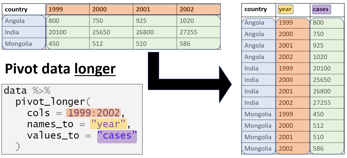
Composition of data visualization: Data
![]()
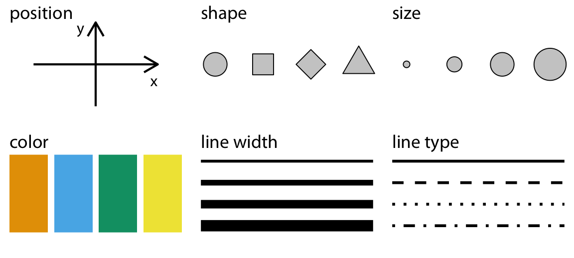
Composition of data visualization: Aesthetics
![]()
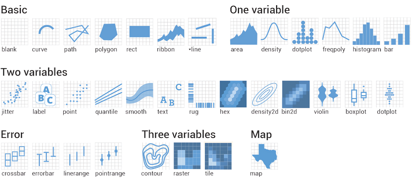
Composition of data visualization: Geometric shapes
![]()
Composition of data visualization: Scales, Coordinates, Labels
![]()
Introducing ggplot2
- Grammar of Graphics:
ggplot2 is based on the idea that you can build any plot from the same components: a data set, a coordinate system, and geoms (visual marks that represent data points).
- Layers: You build plots by adding layers. For example, you can add a layer of points, then a layer of lines, then a layer of labels.