renv::install("ggplot2")
renv::install("reshape2")
renv::install("patchwork")Exercise - Block 2
Introduction to ggplot2
ggplot2 is a powerful and popular R package for creating a wide variety of plots. It is based on the “grammar of graphics” philosophy, which allows you to build plots layer by layer. This makes it easy to create complex and customized visualizations.
Base R vs. ggplot2
| Feature | Base R |
ggplot2 |
|---|---|---|
| Philosophy | “Ink on paper” - you draw elements on the plot. | “Grammar of graphics” - you build plots with layers. |
| Syntax | Functions for specific plots (e.g., plot, hist). |
Consistent syntax with ggplot() + geom_*(). |
| Customization | Can be complex, often requiring many parameters. | Easy to add layers for themes, labels, and annotations. |
| Data Format | Often requires data in specific formats (vectors, matrices). | Prefers data in data frames (long format). |
Installing packages
Installing packages in R could be a time-consuming and a difficult process. Hence, we will use renv R package for installing packages throughout this course.
Packages
library(ggplot2)
library(reshape2)
library(patchwork)
Exploratory data analysis
data <- readRDS(gzcon(url(
  "https://raw.githubusercontent.com/urppeia/publication_figs/main/data.rds"
)))str(data)List of 3
$ counts:'data.frame': 1642 obs. of 13 variables:
..$ Gene_ID : chr [1:1642] "AT1G01090" "AT1G01100" "AT1G01300" "AT1G01320" ...
..$ ERR1736192: num [1:1642] 8.95 10.71 8.26 10.47 9.6 ...
..$ ERR1736193: num [1:1642] 8.75 11.05 8.62 9.85 9.74 ...
..$ ERR1736194: num [1:1642] 8.94 10.76 8.32 10.55 9.43 ...
..$ ERR1736195: num [1:1642] 8.8 10.93 8.52 10.17 9.66 ...
..$ ERR1736196: num [1:1642] 8.88 10.59 8.35 10.64 9.49 ...
..$ ERR1736197: num [1:1642] 8.78 11.02 8.49 9.91 9.76 ...
..$ ERR1736198: num [1:1642] 8.92 10.72 8.33 10.46 9.5 ...
..$ ERR1736199: num [1:1642] 8.92 11 8.73 9.84 9.85 ...
..$ ERR1736200: num [1:1642] 8.86 10.7 8.25 10.54 9.48 ...
..$ ERR1736201: num [1:1642] 8.88 11.04 8.44 9.75 9.78 ...
..$ ERR1736202: num [1:1642] 8.93 10.6 8.32 10.63 9.43 ...
..$ ERR1736203: num [1:1642] 8.81 10.99 8.34 10 9.61 ...
$ diff :'data.frame': 1642 obs. of 6 variables:
..$ Gene_ID : chr [1:1642] "AT1G01090" "AT1G01100" "AT1G01300" "AT1G01320" ...
..$ Gene_name : chr [1:1642] "PDH-E1 ALPHA" "RPP1A" "APF2" "" ...
..$ sucrose_24h_pval: num [1:1642] 0.591 0.569 0.565 0.743 0.884 ...
..$ sucrose_24h_lfc : num [1:1642] 1.1 1.1 1.1 0 0 0 0 1.1 0 1.1 ...
..$ sucrose_3h_pval : num [1:1642] 0.998 0.998 0.998 0.998 0.998 ...
..$ sucrose_3h_lfc : num [1:1642] 0 -1.1 0 1.1 -1.1 0 1.1 0 0 1.1 ...
$ anno :'data.frame': 12 obs. of 4 variables:
..$ Sample_ID: chr [1:12] "ERR1736192" "ERR1736193" "ERR1736194" "ERR1736195" ...
..$ compound : chr [1:12] "none" "none" "sucrose" "sucrose" ...
..$ dose : chr [1:12] "none" "none" "15 millimolar" "15 millimolar" ...
..$ time : chr [1:12] "24 hour" "3 hour" "24 hour" "3 hour" ...data$anno Sample_ID compound dose time
1 ERR1736192 none none 24 hour
2 ERR1736193 none none 3 hour
3 ERR1736194 sucrose 15 millimolar 24 hour
4 ERR1736195 sucrose 15 millimolar 3 hour
5 ERR1736196 none none 24 hour
6 ERR1736197 none none 3 hour
7 ERR1736198 sucrose 15 millimolar 24 hour
8 ERR1736199 sucrose 15 millimolar 3 hour
9 ERR1736200 none none 24 hour
10 ERR1736201 none none 3 hour
11 ERR1736202 sucrose 15 millimolar 24 hour
12 ERR1736203 sucrose 15 millimolar 3 hourhead(data$counts) Gene_ID ERR1736192 ERR1736193 ERR1736194 ERR1736195 ERR1736196 ERR1736197
1 AT1G01090 8.951818 8.745436 8.936055 8.796355 8.881562 8.783848
2 AT1G01100 10.714686 11.049205 10.760942 10.925465 10.586018 11.018331
3 AT1G01300 8.262611 8.621839 8.317833 8.524731 8.351529 8.490846
4 AT1G01320 10.474282 9.846080 10.547565 10.166405 10.638864 9.910971
5 AT1G01620 9.602057 9.741940 9.433688 9.660392 9.487521 9.759061
6 AT1G01960 7.992299 8.164980 7.940793 8.188539 8.066384 8.091465
ERR1736198 ERR1736199 ERR1736200 ERR1736201 ERR1736202 ERR1736203
1 8.918614 8.917665 8.859714 8.880689 8.925662 8.810786
2 10.720866 11.003460 10.697236 11.038316 10.602965 10.990252
3 8.326726 8.726843 8.252066 8.438347 8.321741 8.337898
4 10.459285 9.842758 10.536018 9.752592 10.629175 10.004448
5 9.495713 9.854984 9.475491 9.780328 9.425490 9.608561
6 7.887148 8.068782 8.022251 7.938457 7.981151 8.096472head(data$diff) Gene_ID Gene_name sucrose_24h_pval sucrose_24h_lfc sucrose_3h_pval
10 AT1G01090 PDH-E1 ALPHA 0.5905386 1.1 0.9983381
11 AT1G01100 RPP1A 0.5688959 1.1 0.9983381
33 AT1G01300 APF2 0.5650828 1.1 0.9983381
36 AT1G01320 0.7427942 0.0 0.9983381
69 AT1G01620 PIP1-3 0.8840503 0.0 0.9983381
105 AT1G01960 BIG3 0.8171195 0.0 0.9983381
sucrose_3h_lfc
10 0.0
11 -1.1
33 0.0
36 1.1
69 -1.1
105 0.0Long format data
Long format of counts
counts_long <- melt(data$counts,
  variable.name = "Sample_ID",
  value.name = "Expression"
)
Using Gene_ID as id variableshead(counts_long) Gene_ID Sample_ID Expression
1 AT1G01090 ERR1736192 8.951818
2 AT1G01100 ERR1736192 10.714686
3 AT1G01300 ERR1736192 8.262611
4 AT1G01320 ERR1736192 10.474282
5 AT1G01620 ERR1736192 9.602057
6 AT1G01960 ERR1736192 7.992299Merging samples annotation
data_long <- merge(data$anno, counts_long)head(data_long) Sample_ID compound dose time Gene_ID Expression
1 ERR1736192 none none 24 hour AT1G01090 8.951818
2 ERR1736192 none none 24 hour AT1G01100 10.714686
3 ERR1736192 none none 24 hour AT1G01300 8.262611
4 ERR1736192 none none 24 hour AT1G01320 10.474282
5 ERR1736192 none none 24 hour AT1G01620 9.602057
6 ERR1736192 none none 24 hour AT1G01960 7.992299Boxplot of normalized data
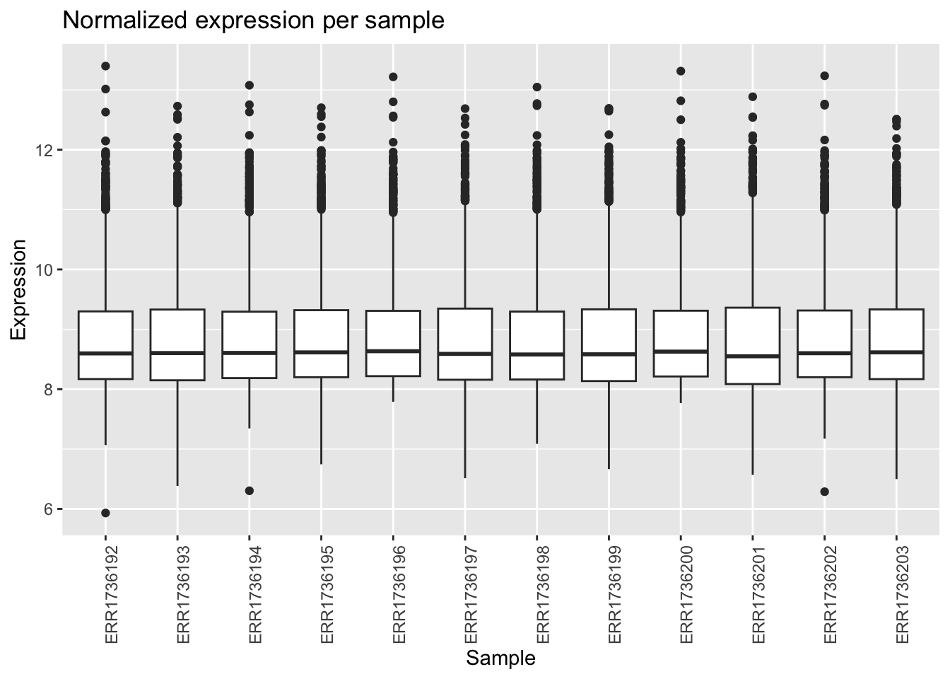
In base R, we used boxplot(). In ggplot2, we use ggplot() and geom_boxplot().
ggplot(data_long, aes(x = Sample_ID, y = Expression)) +
  geom_boxplot() +
  theme(axis.text.x = element_text(angle = 90, hjust = 1)) +
  labs(
    title = "Normalized expression per sample",
    x = "Sample",
    y = "Expression"
  )
Exercise 1
A. Color the boxplots by condition (control vs. sucrose).
Tip
# We need to add the condition information to our long data frame
ggplot(data_long, aes(x = Sample_ID, y = Expression, fill = compound)) +
  geom_boxplot() +
  theme(axis.text.x = element_text(angle = 90, hjust = 1)) +
  labs(
    title = "Normalized expression per sample",
    x = "Sample",
    y = "Expression"
  ) +
  scale_fill_manual(values = c("none" = "steelblue", "sucrose" = "tomato"))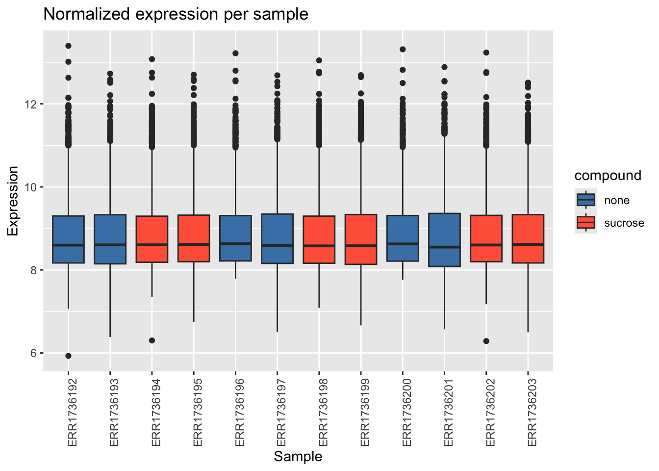
B. Remove the boxplot outliers.
Tip
ggplot(data_long, aes(x = Sample_ID, y = Expression, fill = compound)) +
  geom_boxplot(outlier.shape = NA) +
  theme(axis.text.x = element_text(angle = 90, hjust = 1)) +
  labs(
    title = "Normalized expression per sample",
    x = "Sample",
    y = "Expression"
  ) +
  scale_fill_manual(values = c("none" = "steelblue", "sucrose" = "tomato"))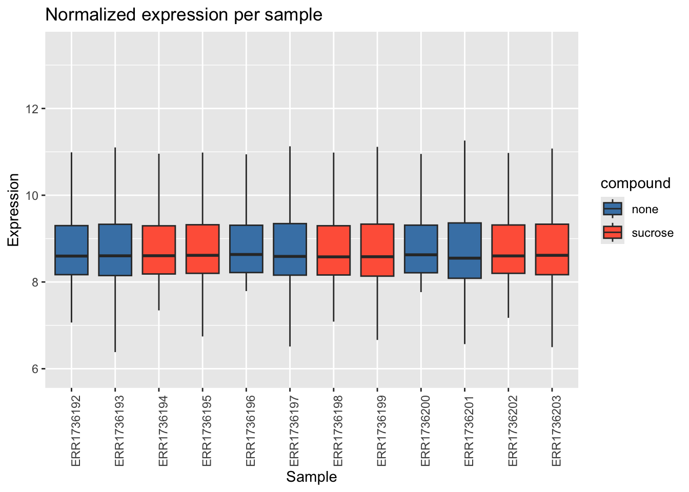
C. Make a Violin plot.
Tip
ggplot(data_long, aes(x = Sample_ID, y = Expression, fill = compound)) +
  geom_violin() +
  theme(axis.text.x = element_text(angle = 90, hjust = 1)) +
  labs(
    title = "Normalized expression per sample",
    x = "Sample",
    y = "Expression"
  ) +
  scale_fill_manual(values = c("none" = "steelblue", "sucrose" = "tomato"))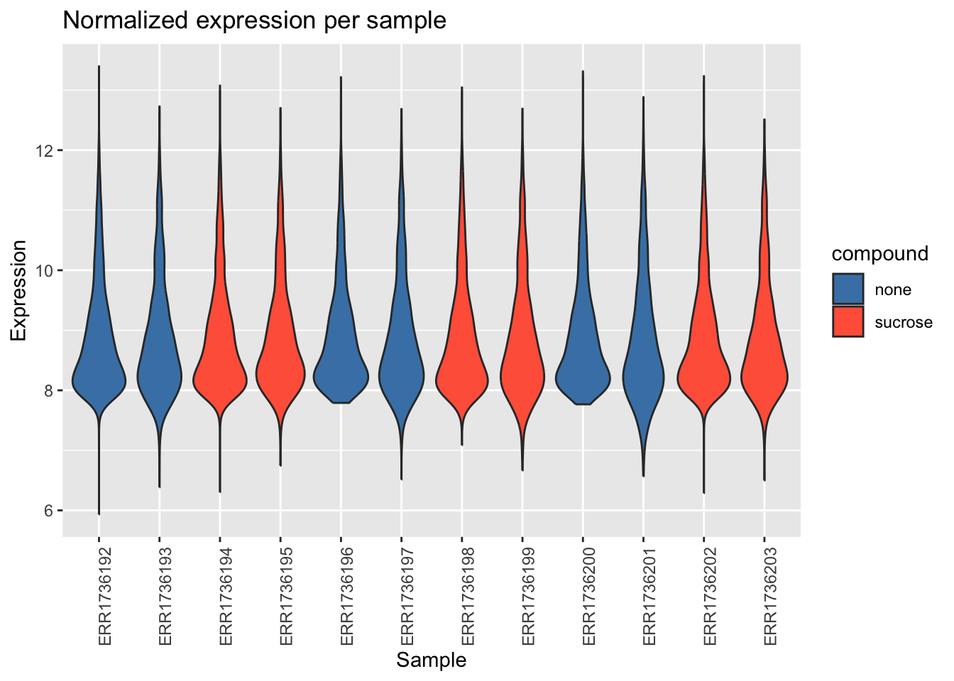
D. A Raincloud might be better for visualization. We learnt this in the first block. Can you make this?
Tip
library(PupillometryR)

ggplot(data_long, aes(x = Sample_ID, y = Expression, fill = compound, color = compound)) +
  # flat violin (half-violin for Raincloud look)
  geom_flat_violin(
    color = "black",
    alpha = 0.5,
    position = position_nudge(x = -0.15)
  ) +

  # stacked dots for “rain”
  geom_dotplot(
    binaxis = "y",
    stackdir = "down",
    dotsize = 0.02,
    binwidth = 0.1,
    position = position_nudge(x = 0.05),
    alpha = 0.8
  ) +

  # colors
  scale_fill_manual(values = c("none" = "steelblue", "sucrose" = "tomato")) +
  scale_color_manual(values = c("none" = "steelblue", "sucrose" = "tomato")) +
  # labels
  labs(
    x = "Samples",
    y = "Expression",
    title = "Boxplot",
    subtitle = "Sucrose at 3h and 24h",
    caption = "This is a Boxplot of Sucrose comparison."
  ) +
  theme(axis.text.x = element_text(angle = 90, hjust = 1)) +
  facet_grid(compound~dose)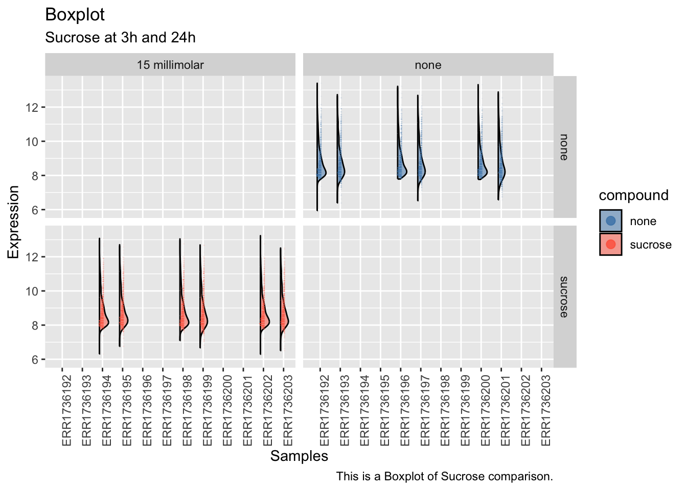
Barplot of mean expression
In base R, we used barplot(). In ggplot2, we use geom_bar() or geom_col().
ggplot(data_long, aes(x = Sample_ID, y = Expression, fill = compound)) +
  geom_bar(stat = "summary", fun = mean, position = "dodge") +
  theme(axis.text.x = element_text(angle = 90, hjust = 1, vjust = 0.5)) +
  labs(
    title = "Mean normalized expression per sample",
    x = "Sample",
    y = "Mean Expression"
  ) +
  scale_fill_manual(values = c("none" = "steelblue", "sucrose" = "tomato"))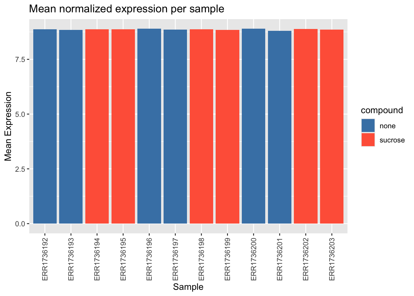
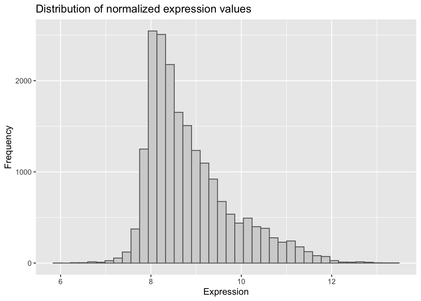
Histogram of expression values
In base R, we used hist(). In ggplot2, we use geom_histogram().
ggplot(data_long, aes(x = Expression)) +
  geom_histogram(bins = 40, fill = "lightgray", color = "gray40") +
  labs(
    title = "Distribution of normalized expression values",
    x = "Expression",
    y = "Frequency"
  )
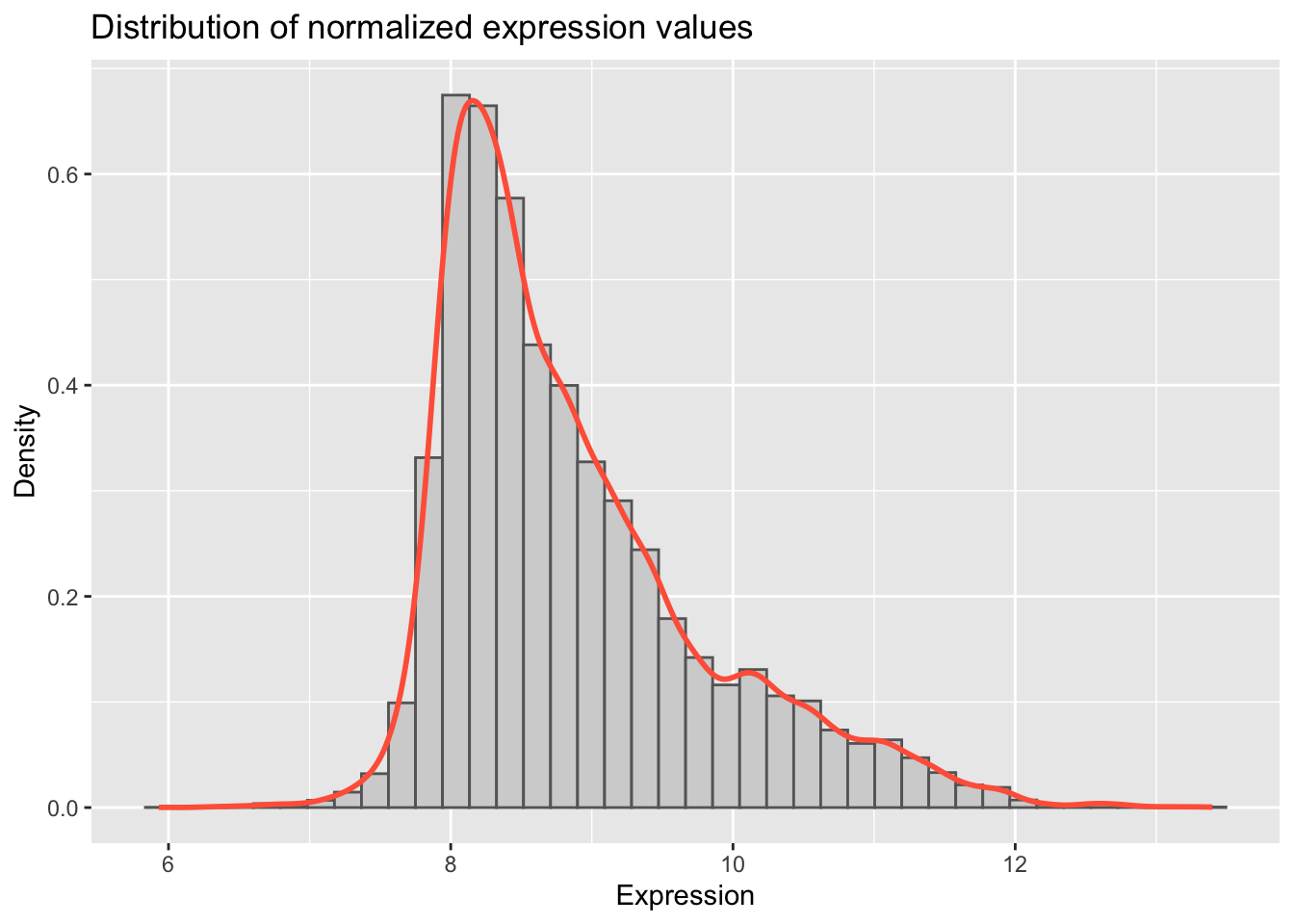
Exercise 2
Add a density curve to the histogram.
Tip
ggplot(data_long, aes(x = Expression)) +
  geom_histogram(aes(y = after_stat(density)),
    bins = 40,
    fill = "lightgray", color = "gray40"
  ) +
  geom_density(color = "tomato", linewidth = 1) +
  labs(
    title = "Distribution of normalized expression values",
    x = "Expression",
    y = "Density"
  )
Volcano plot of differential results
In base R, we used plot(). In ggplot2, we use geom_point().
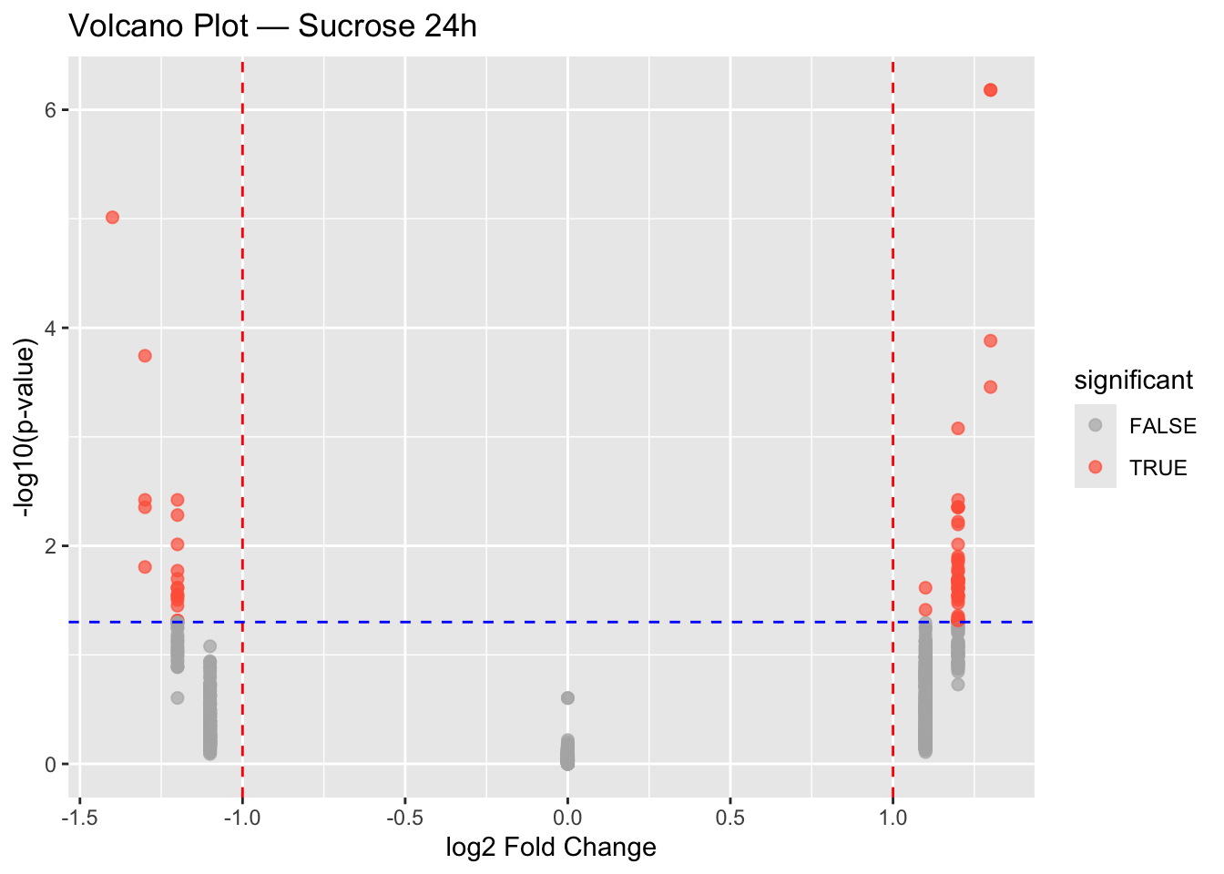
Sucrose 24h
diff_df_24h <- data.frame(
  lfc = data$diff$sucrose_24h_lfc,
  pval = data$diff$sucrose_24h_pval
)
diff_df_24h$significant <- diff_df_24h$pval < 0.05 & abs(diff_df_24h$lfc) > 1

ggplot(diff_df_24h, aes(x = lfc, y = -log10(pval), color = significant)) +
  geom_point(size = 2, alpha = 0.7) +
  scale_color_manual(values = c("gray70", "tomato")) +
  geom_vline(xintercept = c(-1, 1), linetype = "dashed", color = "red") +
  geom_hline(yintercept = -log10(0.05), linetype = "dashed", color = "blue") +
  labs(
    title = "Volcano Plot — Sucrose 24h",
    x = "log2 Fold Change",
    y = "-log10(p-value)"
  )
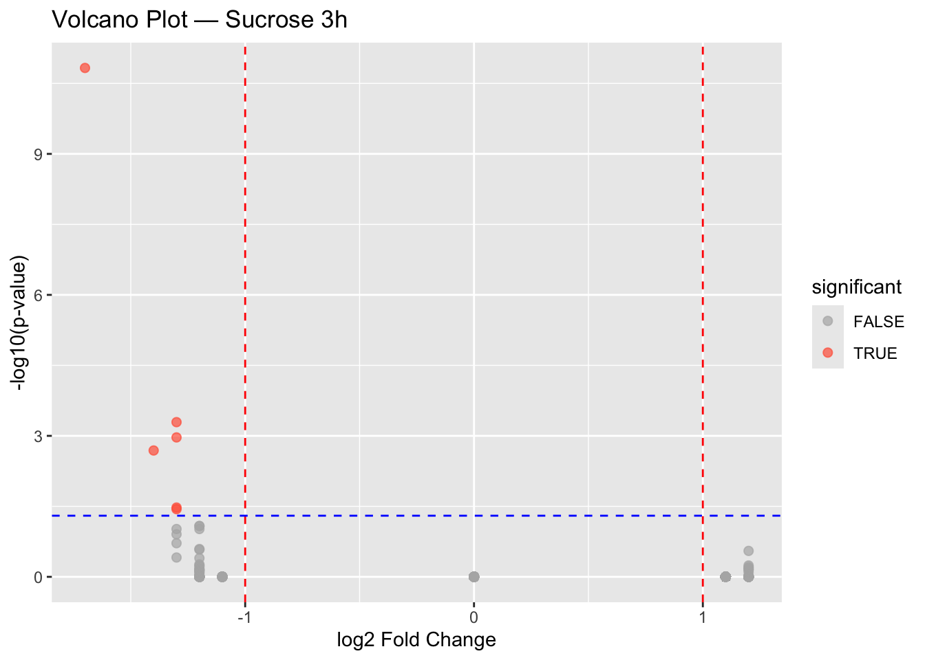
Exercise 3
Create a volcano plot for the 3h sucrose treatment.
Tip
diff_df_3h <- data.frame(
  lfc = data$diff$sucrose_3h_lfc,
  pval = data$diff$sucrose_3h_pval
)
diff_df_3h$significant <- diff_df_3h$pval < 0.05 & abs(diff_df_3h$lfc) > 1

ggplot(diff_df_3h, aes(x = lfc, y = -log10(pval), color = significant)) +
  geom_point(size = 2, alpha = 0.7) +
  scale_color_manual(values = c("gray70", "tomato")) +
  geom_vline(xintercept = c(-1, 1), linetype = "dashed", color = "red") +
  geom_hline(yintercept = -log10(0.05), linetype = "dashed", color = "blue") +
  labs(
    title = "Volcano Plot — Sucrose 3h",
    x = "log2 Fold Change",
    y = "-log10(p-value)"
  )
Combining plots
In base R, we used par(mfrow = ...). In the ggplot2 ecosystem, the patchwork package is a popular choice.
library(patchwork)

p1 <- ggplot(diff_df_24h, aes(x = lfc, y = -log10(pval), color = significant)) +
  geom_point(size = 2, alpha = 0.7) +
  scale_color_manual(values = c("gray70", "tomato")) +
  labs(title = "Sucrose 24h")

p2 <- ggplot(diff_df_3h, aes(x = lfc, y = -log10(pval), color = significant)) +
  geom_point(size = 2, alpha = 0.7) +
  scale_color_manual(values = c("gray70", "tomato")) +
  labs(title = "Sucrose 3h")
p1 | p2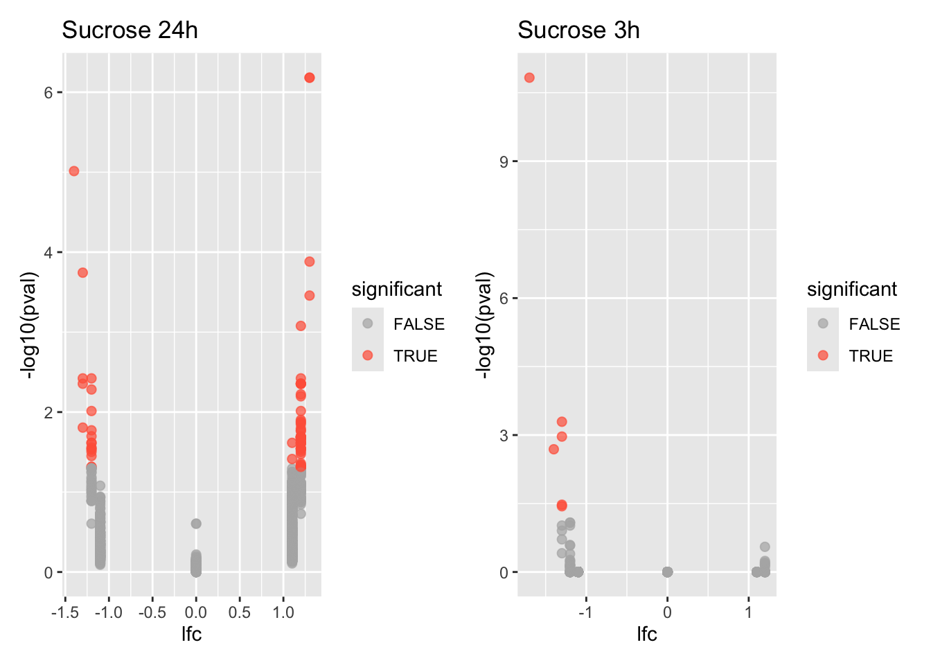
p1 / p2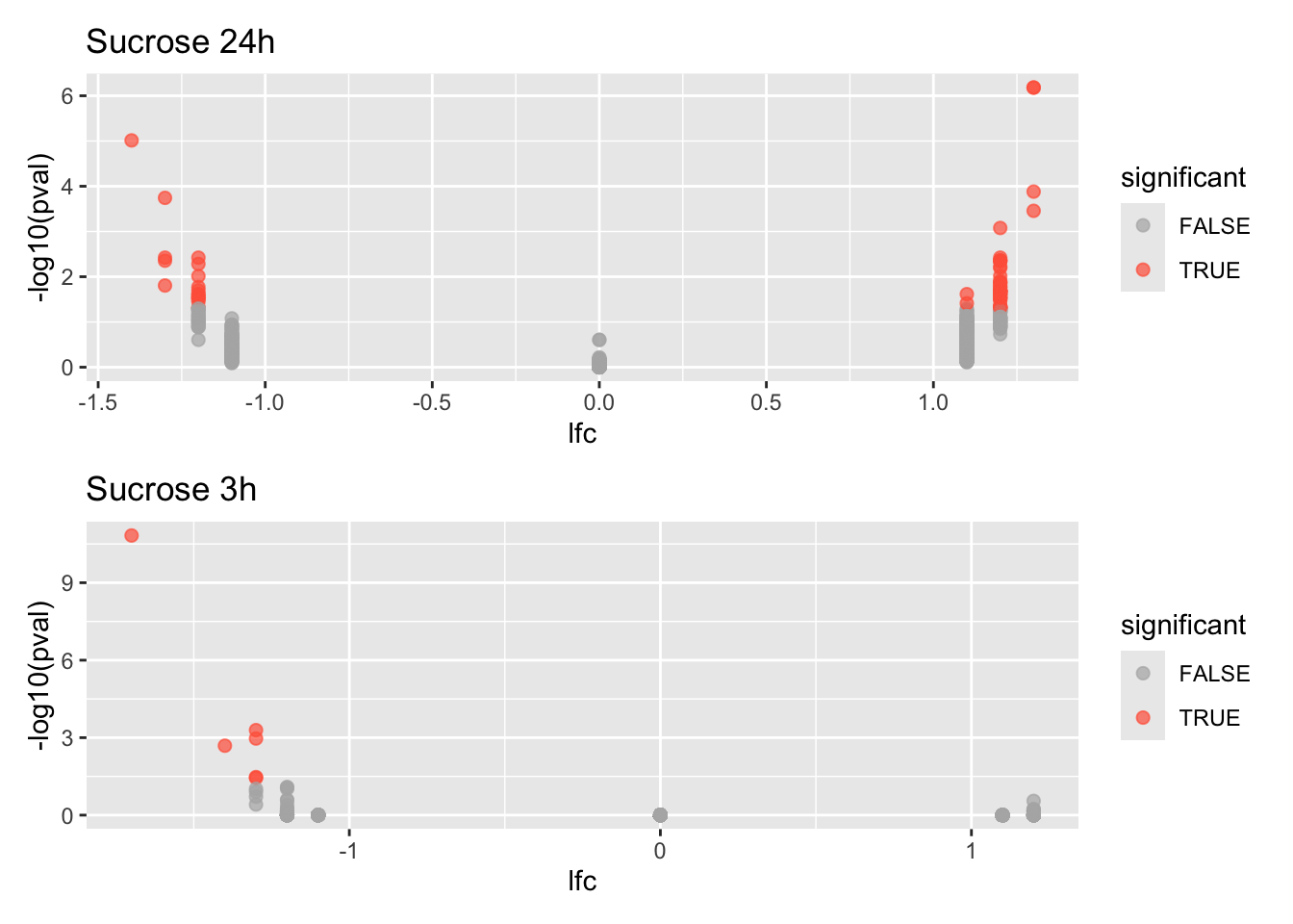
Session information
Tip
sessionInfo()R version 4.5.1 (2025-06-13)
Platform: aarch64-apple-darwin20
Running under: macOS Tahoe 26.0.1
Matrix products: default
BLAS: /Library/Frameworks/R.framework/Versions/4.5-arm64/Resources/lib/libRblas.0.dylib
LAPACK: /Library/Frameworks/R.framework/Versions/4.5-arm64/Resources/lib/libRlapack.dylib; LAPACK version 3.12.1
locale:
[1] en_US.UTF-8/en_US.UTF-8/en_US.UTF-8/C/en_US.UTF-8/en_US.UTF-8
time zone: Europe/Zurich
tzcode source: internal
attached base packages:
[1] stats graphics grDevices datasets utils methods base
other attached packages:
[1] PupillometryR_0.0.5 rlang_1.1.6 dplyr_1.1.4
[4] patchwork_1.3.2 reshape2_1.4.4 ggplot2_4.0.0
loaded via a namespace (and not attached):
[1] gtable_0.3.6 jsonlite_2.0.0 compiler_4.5.1
[4] BiocManager_1.30.26 renv_1.1.5 tidyselect_1.2.1
[7] Rcpp_1.1.0 stringr_1.5.2 tidyr_1.3.1
[10] scales_1.4.0 yaml_2.3.10 fastmap_1.2.0
[13] R6_2.6.1 plyr_1.8.9 labeling_0.4.3
[16] generics_0.1.4 knitr_1.50 htmlwidgets_1.6.4
[19] tibble_3.3.0 pillar_1.11.1 RColorBrewer_1.1-3
[22] stringi_1.8.7 xfun_0.53 S7_0.2.0
[25] cli_3.6.5 withr_3.0.2 magrittr_2.0.4
[28] digest_0.6.37 grid_4.5.1 lifecycle_1.0.4
[31] vctrs_0.6.5 evaluate_1.0.5 glue_1.8.0
[34] farver_2.1.2 purrr_1.1.0 rmarkdown_2.30
[37] tools_4.5.1 pkgconfig_2.0.3 htmltools_0.5.8.1