Block 3
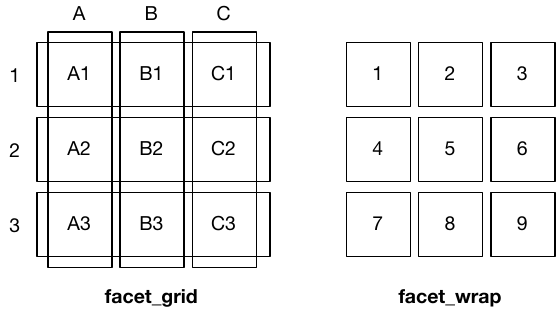
Faceting the plots
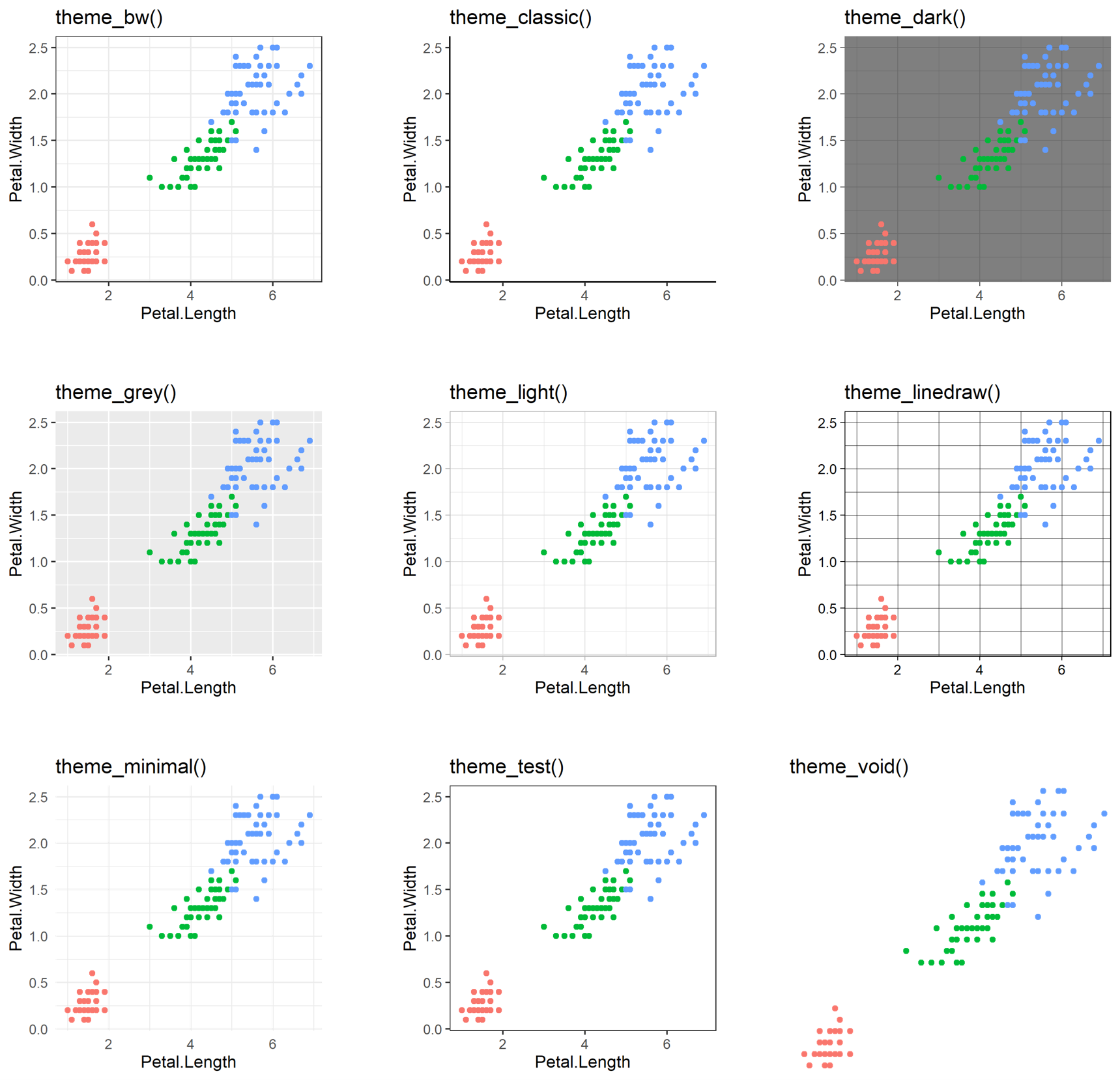
Themes
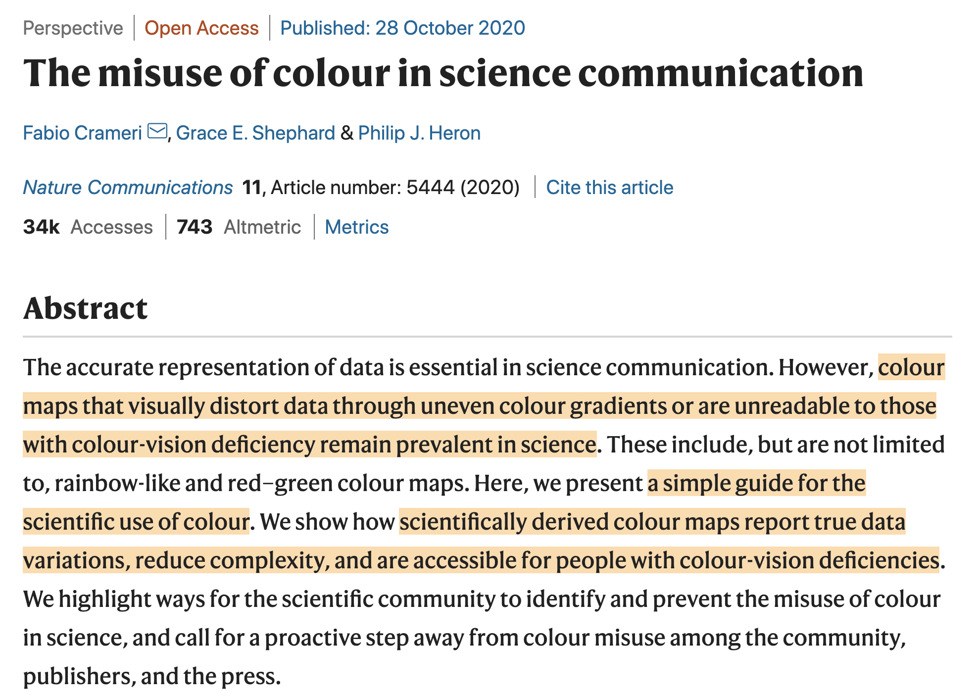
Simplified schematic of human color perception
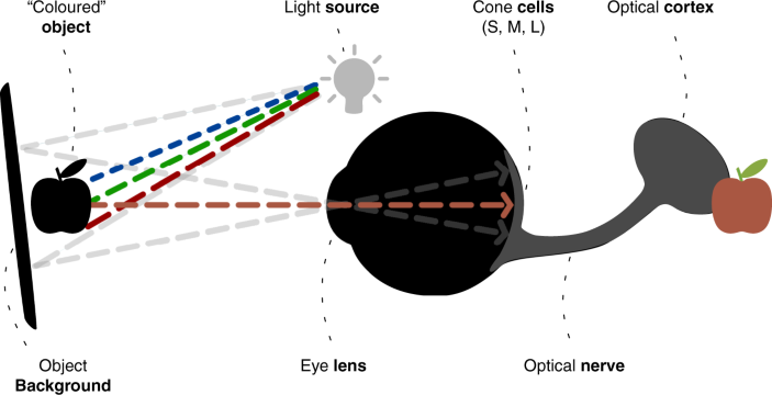
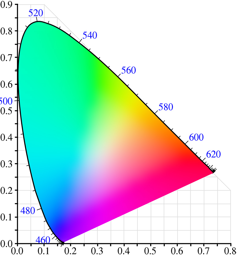
Rainbow colormap
Perceptually non-uniform color spaces

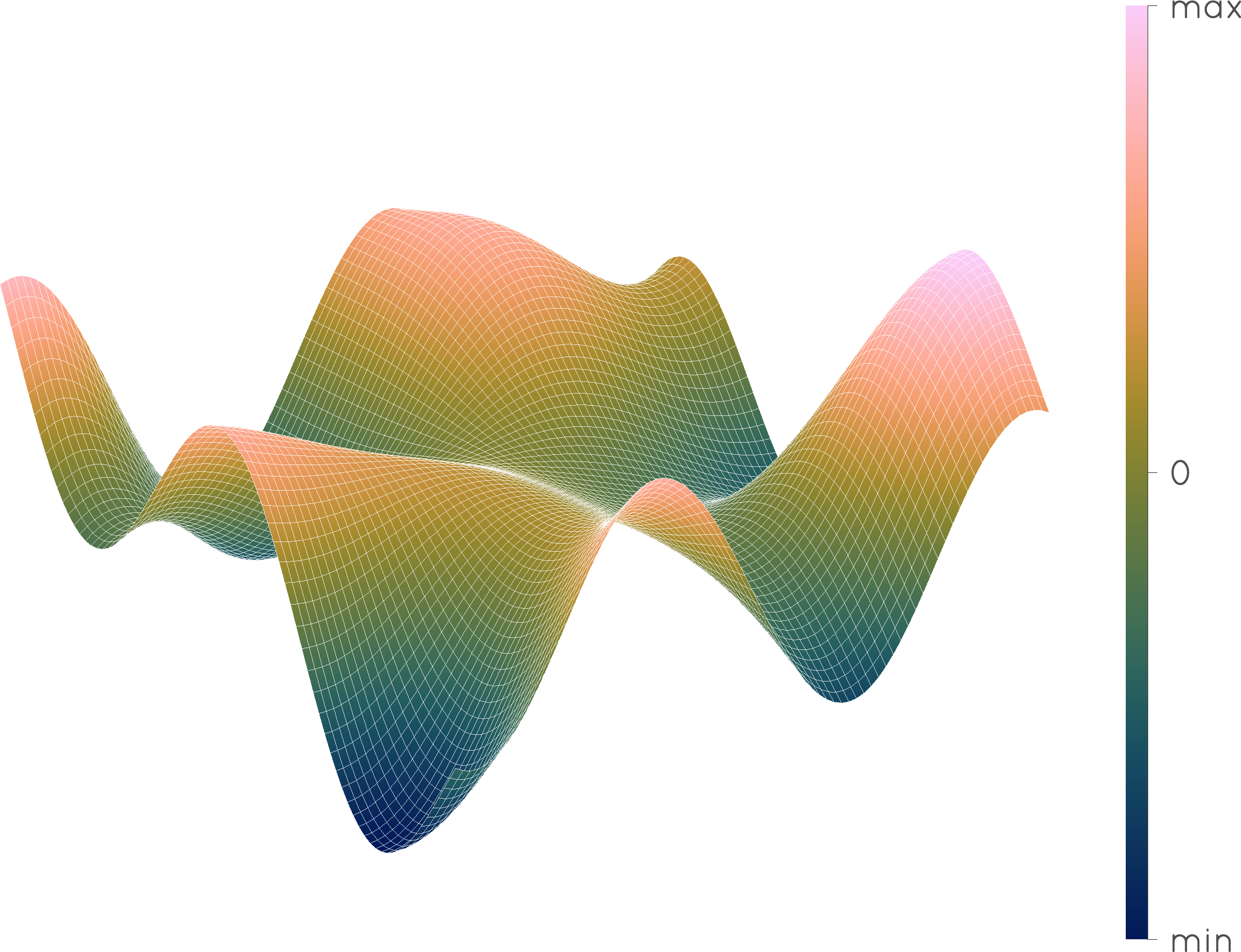
Perceptually uniform color spaces
Non-uniform
Uniform

If we want to operate with color as it relates to the human vision, we need a color space built on these human measurements, and that is what perceptually uniform color spaces are.
Color selection is important
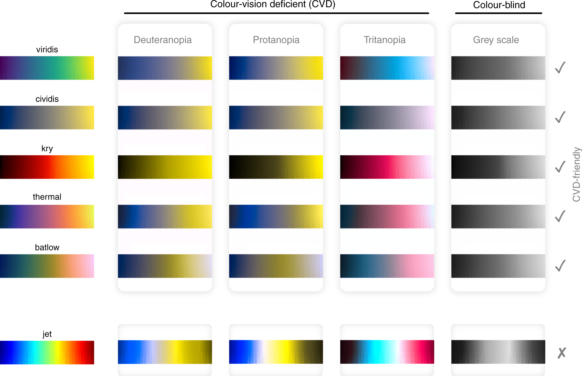
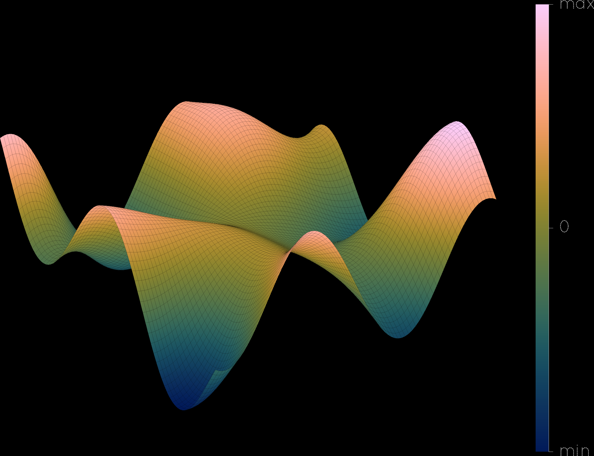
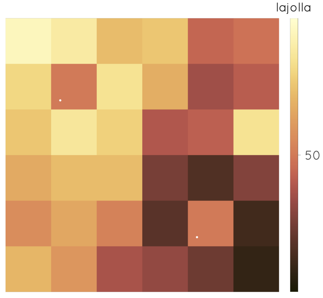
Spot the difference
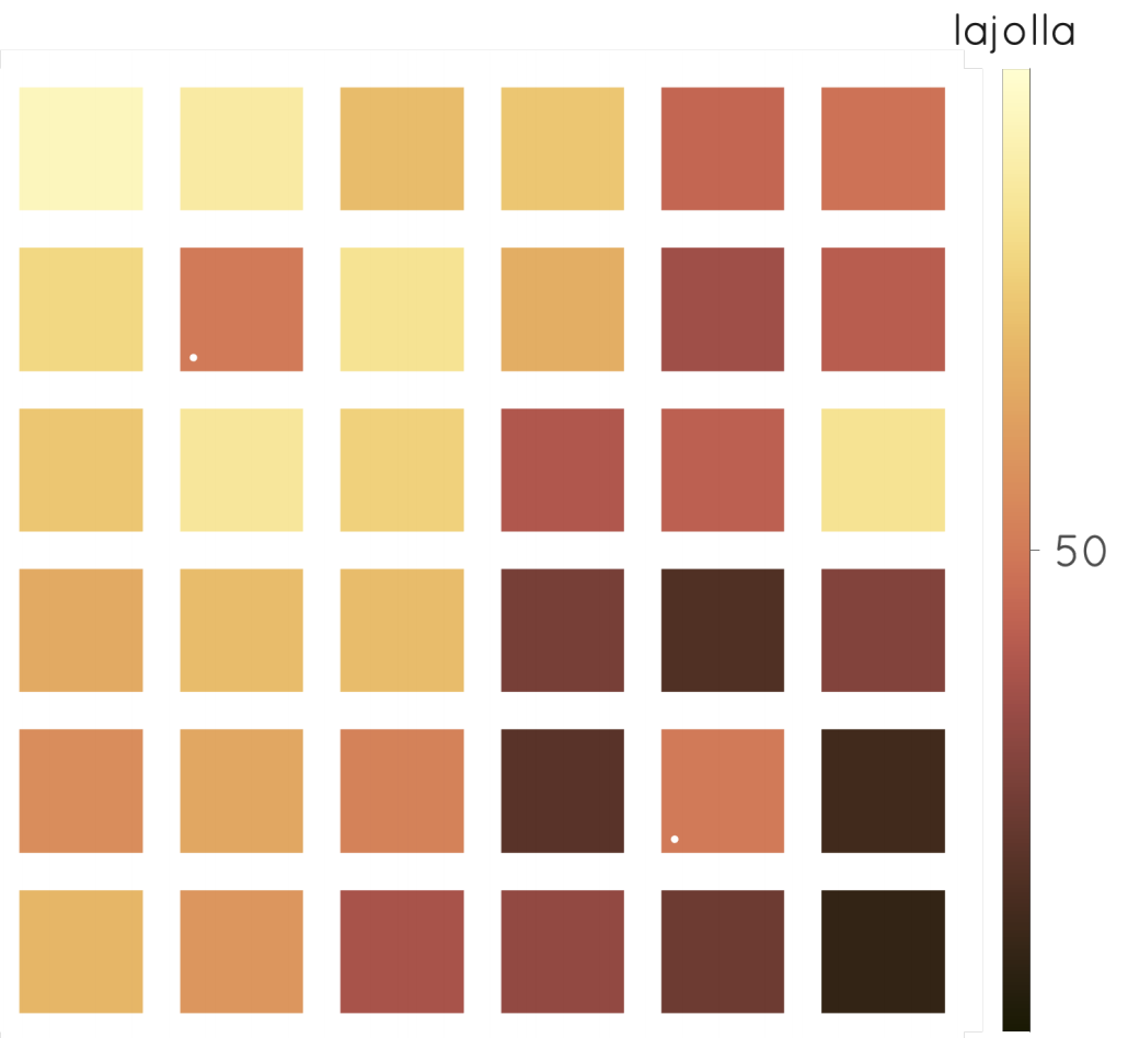
Background of plots